
Source: nerdist.com
8. The Ugly: The Visual Aesthetic
Behind the scenes info!!!!!!! So the original cut of this film was dark and dour and depressing and, from all reports, boring as sin. But when that great pop-y Bohemian Rhapsody scored trailer kicked everybody’s ass, Warner freaked out and realized they needed to redo the movie. So they hired the company that edited the trailer and let them edit the movie. This is what people in and around the entertainment industry refer to as “a really bad ideaâ€.
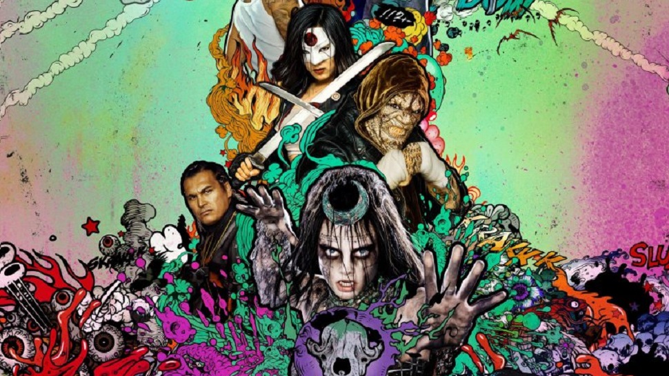
As a result, most of this movie feels like the longest trailer ever made. Quick cuts that make it difficult to understand what’s going on, scenes and shots being jarringly stitched together and oh my god the stylization. This movie is a literalization of the phrase “style over substanceâ€. The in-your-face music cues and cartoonish visual transitions try to communicate some sort of uniqueness, but wind up seeming like a particularly “edgy†13-year-old covered the screen in the doodles he did in the margins of his history book.
Want to know what the movie looks like? Check out the posters. Look, I’m glad the DCEU discovered that colors are things that exist, but why’d they have to find sickly greens and washed out pinks first?
There is a reason color palate matters. If you pay attention to it, your movie won’t look like someone threw up in a washing machine.
